Getting into the Flow
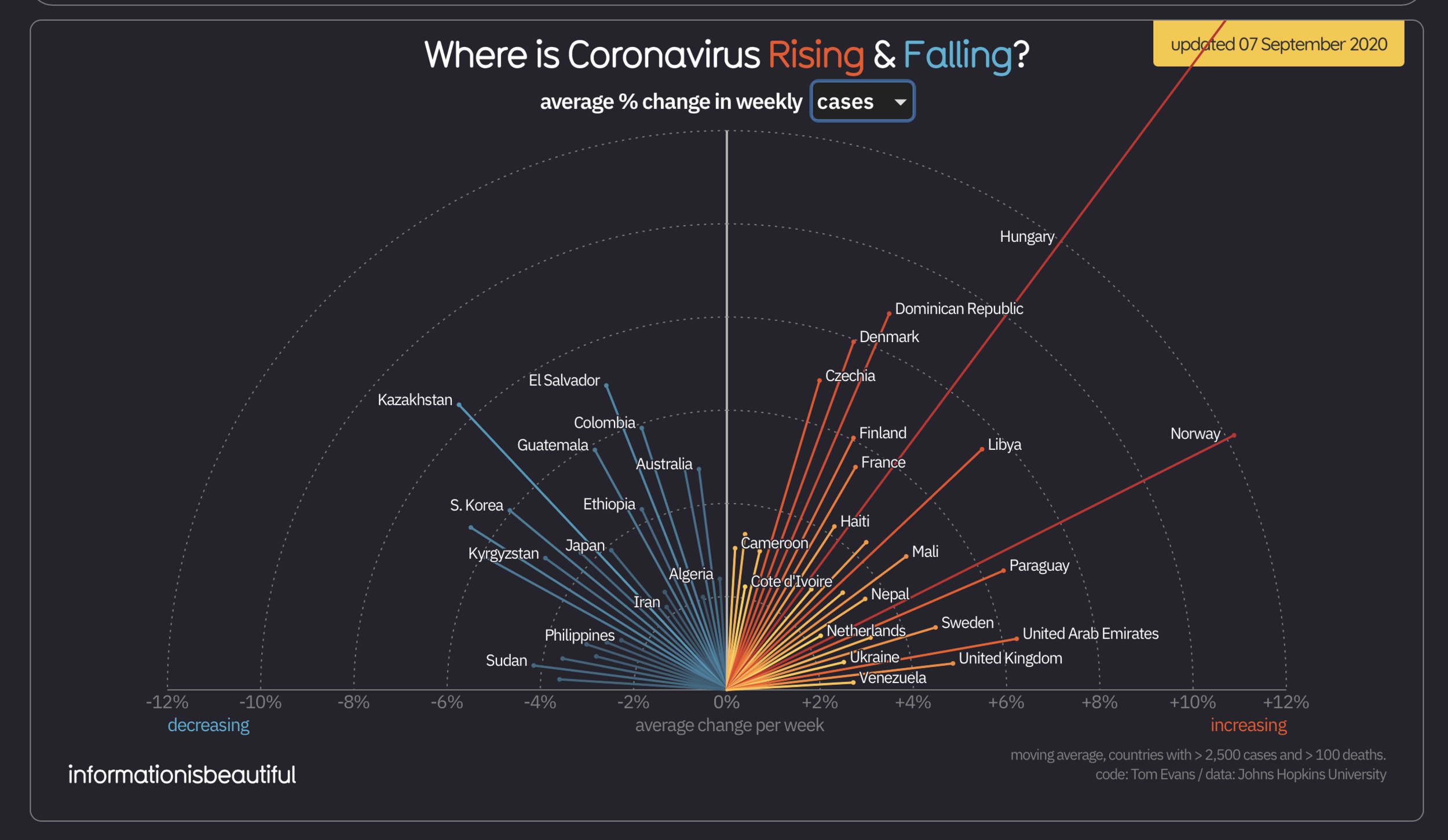
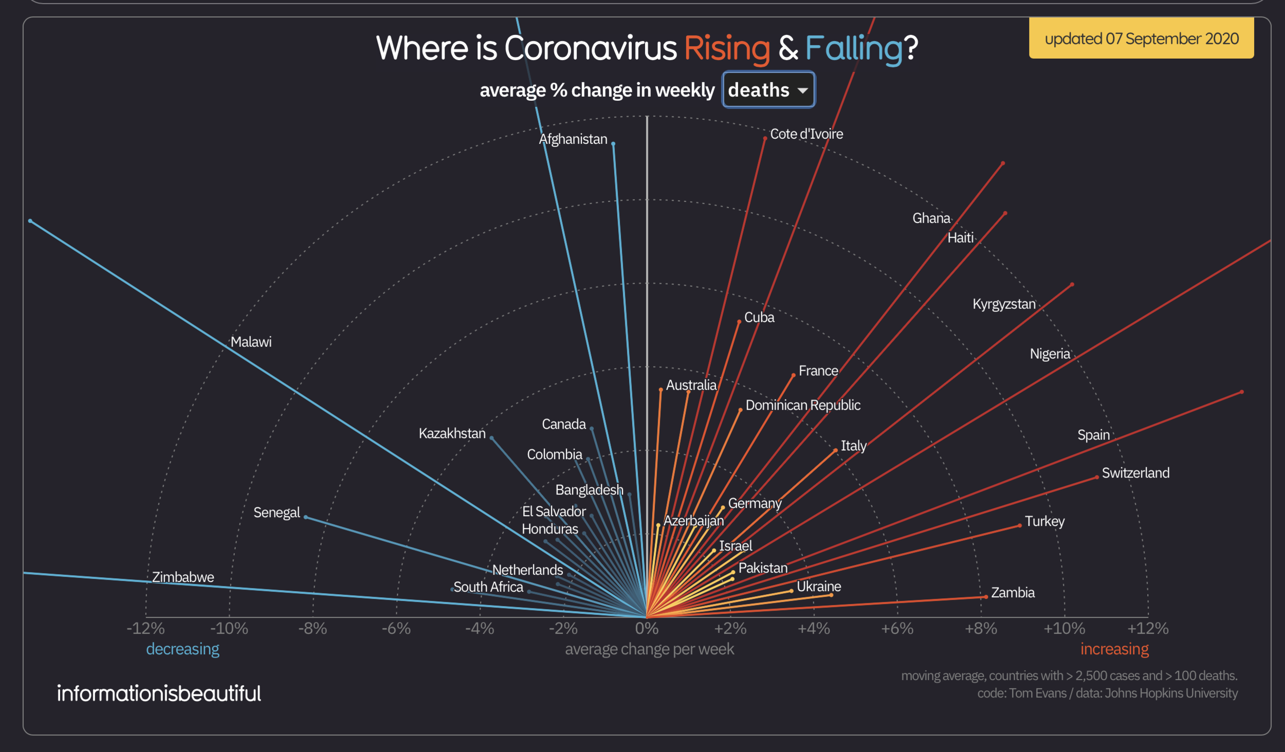
I particularly liked this weekly-updated graphic on the average percent change of coronavirus cases and deaths from “Information Is Beautiful.” It allows the viewer to trail one particular country and identify the differences between its case rate and death rate, which provides clear insight into other metrics, like the efficiency of a country’s health care system, wealth, and sense of community responsibility. The graphic also used distinct colors to show decreasing percentages (blue) and increasing percentages (yellow/red) that intuitively helped me, the viewer, understand its overall theme. Plus, when I was hovering over individual countries’ bars while hunting for specific statistics, the visualization brings up details about percentage increase or decline, total cases, total deaths, and case fatality rates.
After being continually confronted with the United States’ (admittedly grim) COVID-19 statistics for months, it was interesting to examine this visualization and get a little more context on how the rest of the world is dealing with the pandemic. It also forced me to question my perception of some countries, often incorrectly stereotyped as lesser than America in some way, who have so strikingly succeeded at containing the illness.