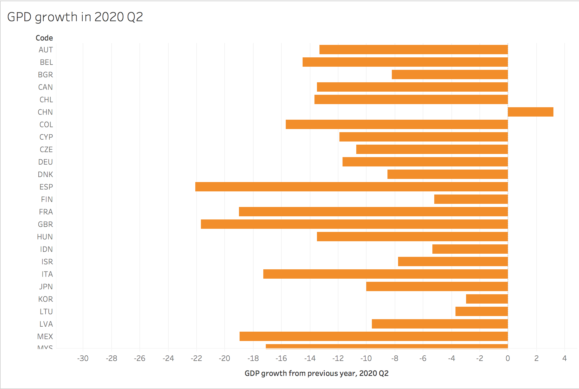
First Chart
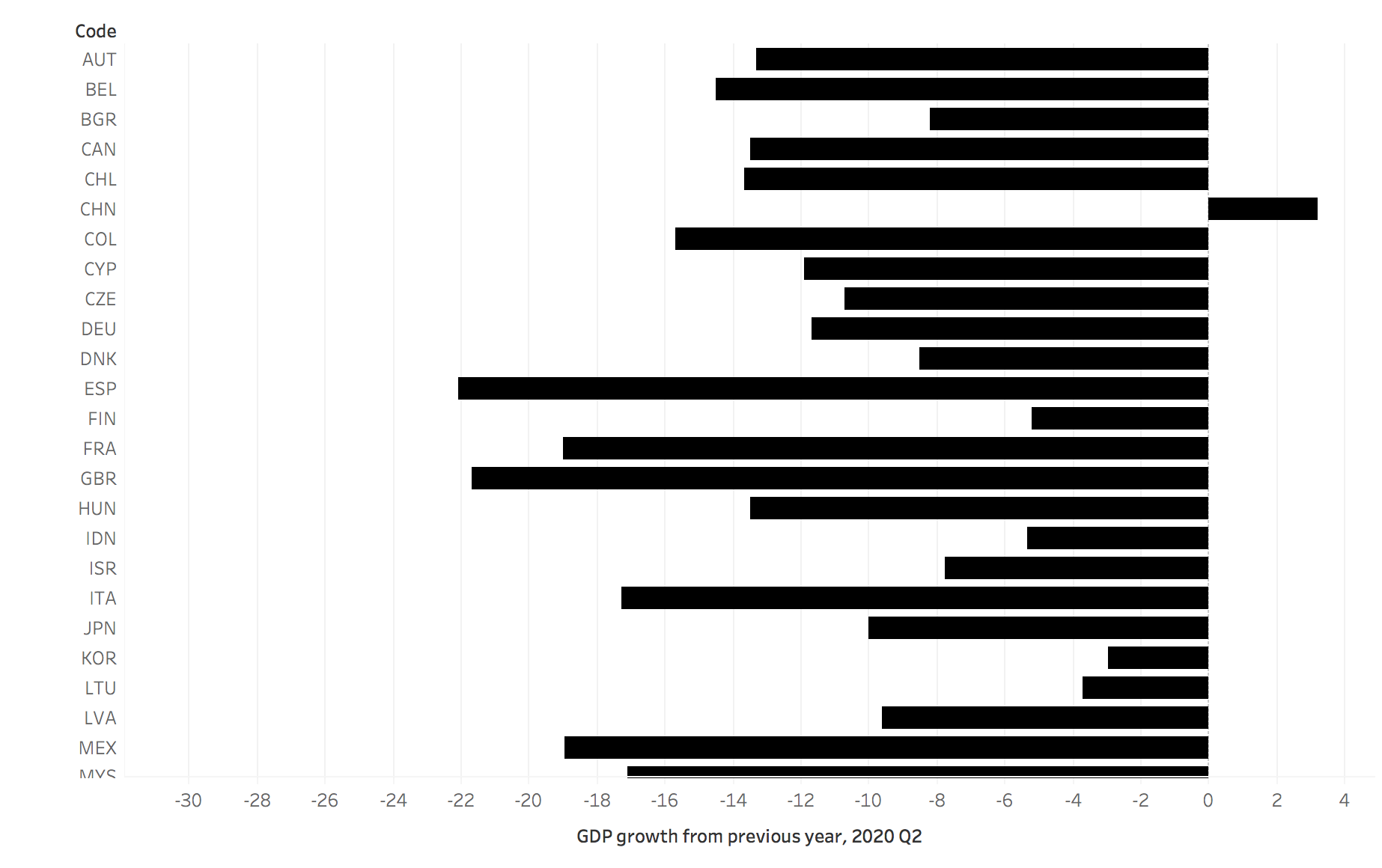
Final Chart
In Progress (1)
In Progress (2)
To create this chart, I used data about GDP from Our World in Data. After downloading and importing the Data in Tableau, I played around and decided it would be best as a bar chart using the country codes and the percentage GDP growth or decline from each year. I then added a title to make the graph easier to read and changed up the color of the bars.
After finishing the chart, I have these questions.
Why is China the only country with an increase in GDP? What factors contributed to this difference?
How does the GDP increase/decrease of each country in 2020 (as shown here) relate to their success of preventing spread of the coronavirus? Are countries with higher case numbers/more transmission doing worse economically?
Is there a way to display this data in order of GDP increase/decrease? If the codes were listed in order of least decrease to most decrease, for example, it may be easier to the viewer to read.